MEDIUM
Medium’s New Logo, Through the Lens
Here’s the simple idea underneath something so complex

A brand. An identity. A story.
Call it what you want, but a logo is more than a visual stimulus that denotes an organization. And unlike the personal blogs you worked on years ago, brand pivots cost their firms money and time. A toll that might go up to millions of dollars and days of development time.
While it’s easier if the organization doesn’t deal with physical products, logo redesigns are massive undertakings that involve a great deal of pushing back and forth between departments before a common design is chosen. Once you commit to a design, change is going to cost your business. With all that out of the way, let’s get to Medium.
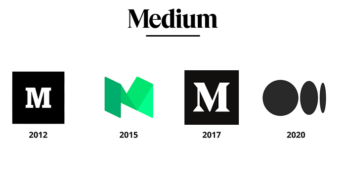
With over 120 million monthly active readers, Medium has come a long way from 2012. Its logo has undergone a couple of revisions in the past, modifications that I wouldn’t call significant. They have all been heralds of Medium’s approach to storytelling, complete with the capital M. Those logos never strayed from the rules that most logos from successful corporations follow: being unique, simple, and scalable. They fit the brand perfectly like magnets on a fridge.
Medium managed to carve a niche amidst reputed magazines and highly regarded newspapers and its logo certainly played a role in its success. It wasn’t the most novel logo out there but it stood its own against both traditional magazines and virtual content platforms. The bold M meant business and is instantly recognizable today. But the logo that went online a few hours ago marks a significant departure in the history of Medium. One that is certain to divide its users.
It doesn’t have an M anymore. What do those circles even mean? But before you whip out your pitchforks and head to Twitter, here’s what the shapes represent. Or what they represent to a college graduate with zero logo design experience (yours truly).

Through the lens
What’s the one thing that can irrevocably change how you see a collection of emotions, facts, or events? Perspective.
Medium has always been about stories. Fact or fiction, they present a glimpse into not just the story itself, but the framework of the writer’s mind as well. This aligns neatly with Medium’s new focus on relational content over transactions between writers and readers. It also plays nice with the new logo, one that is clearly open to interpretation. Here’s what I see at the end: a convex lens. I hope my high-school Physics teacher isn’t reading this.
Here’s how a convex lens works: it converges rays of light to a point called the focus. It achieves this by being thicker in the middle. Convex lenses feature prominently in our lives from microscopes and magnifying glasses to cameras and yes, the human eye. The idea is once more open to possibilities when it comes to defining what Medium intends to stand for.

Double meaning
Whether Medium acts like a medium (sorry) that brings together perspectives of all kinds or is an instrument that lets you see what you want to see is a question that you need to answer for yourself. I’m not going to say that Medium’s got a winning logo on their hands. Not every reader is going to perform the mental acrobatics I did. Some are certainly going to long for the good-old capital M. And while an M embodied Medium fairly well, it remains to be seen whether these lenses are up to the task.
While I don’t intend to paint a bleak picture, Medium has already stirred the beehive with a redesign that has pleased some and irked many. It takes me back to the days when people used absurd color combinations for blog backgrounds and fonts. In moderation, the possibilities are endless.
Medium has dialed back most of the more experimental pivots but it’ll be a while before the new normal catches on. Add in a divisive logo redesign and you’ve concocted a rather interesting recipe, one equal parts controversy, and possibility.
Farewell Medium. Long live Medium.
PS — Here’s a bonus for those who’ve come this far. The following logos were designs created by Medium in 2015 on its pursuit to reimagine its brand.
Edit: Turns out I was right. Minus the bit where the logo resembles an ellipsis. Here’s what Medium has to say on its new logo.

